|
Why do certain colors trend? Have you noticed, that you haven't been able to find a pair of hot pink pumps for decades? Want to replace that eggplant bath rug, but can't find that color anywhere anymore? Color forecasting is done in advance and the entire manufacturing industry jumps on board, from fashion, to home decor, to print advertising. 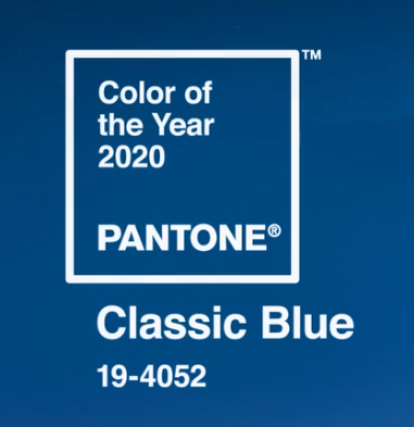 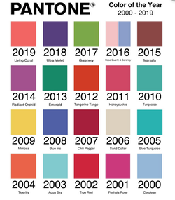 Pantone is recognized worldwide, designers pay attention, The color forecasters gather and talk color, until they come up with the "Color of the Year". Decision by committee. Personally, I feel that the new blue is a bit heavy and depressing for the dawn of a new decade. Yes, we need to feel peaceful, but we also need to feel hopeful. If I was on the international color forecasting board I would block this conservative decision ;) More on Pantone 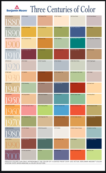 Let's look further back by decade, the roaring 20's brought a sense of adventure, war was over, people felt lighter, colors were soft and sophisticated. I doubt people thought much about color during the depression and WWII. Life was pretty drab, pigments and paint were expensive. The dawn of the 50's was a time for celebration, again, a sense of freedom and expression, kitchens were soft pink and turquoise, even automobiles came out in sexy new colors and everyone owned one or two. Here's a swatch of Pontiac car colors from the Spring collection of 1956. As enchanting as an Easter Parade! 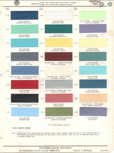 As we moved into the psychedelic 60's, people and colors became bolder and brighter. Rock and roll and flower power pushed the colors to an exciting new level.
Earth and energy dominated the 70's psyche with the awareness of polluted waterways, gas shortages and the oil embargo, people craved a connection to earth. Dark wood, textured macrame and pottery took center stage. Brown, green and golds could be found everywhere, including your refrigerator. The "me generation" of the 80's brought on the Miami Vice vibe, carefree and light. Who didn't have something mauve or teal or country blue in their home? By the 90's colors were deeper, the khaki colors of Grunge. The world didn't end with Y2K and vivid orange and fresh green celebrated the new Millennium. Colors were highly saturated and exciting, bold with contrast. Color has the ability to affect mood, it reflects our collective conscience, we crave different colors at different times of our lives. I ask, what color do you need in your life right now? Color can be very powerful. Use it wisely. UPDATE: This new decade took a turn - see the 2023 Color Forecast Here
0 Comments
Your comment will be posted after it is approved.
Leave a Reply. |
Color & Design
Transform Your Space. Creating inspirational spaces to work, live and play in. Archives
December 2022
Categories
All
|
 RSS Feed